Empowering Americans to save & invest every day.
Overview
Acorns is a financial platform that simplifies investing through automated portfolios, alongside banking, retirement, savings, family accounts, and financial education.
I led end-to-end product design from discovery and strategy through execution, partnering cross-functionally across banking, education, and growth to deliver impactful customer experiences and business outcomes.
The Problem
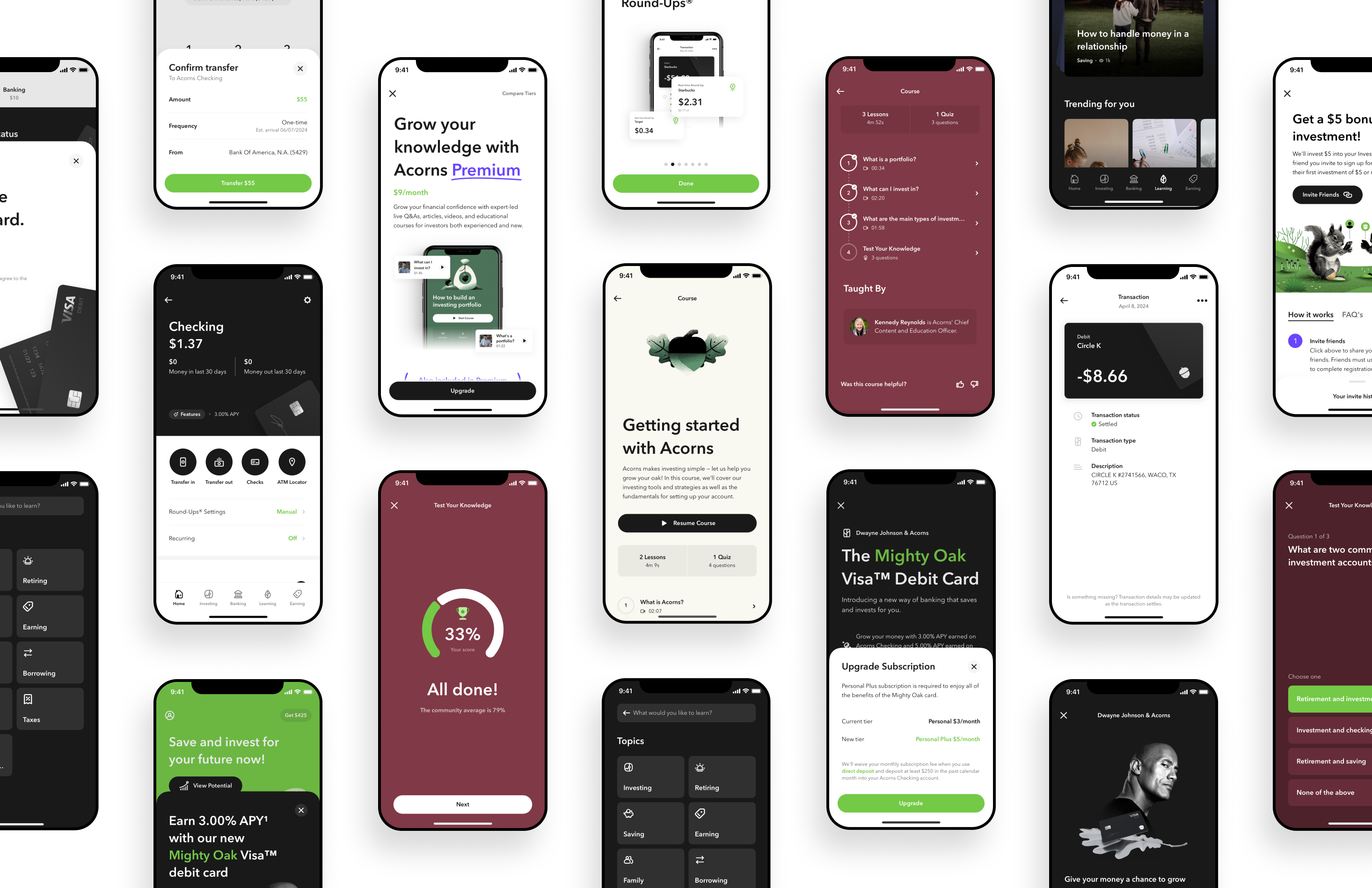
As Acorns grew beyond investing into banking, borrowing, and education, Checking, Money Movement, the Mighty Oak card, and the Learn section had each been designed and shipped on their own timeline. Individually, they worked. Together, the direction wasn't always clear.
Inconsistent visual language
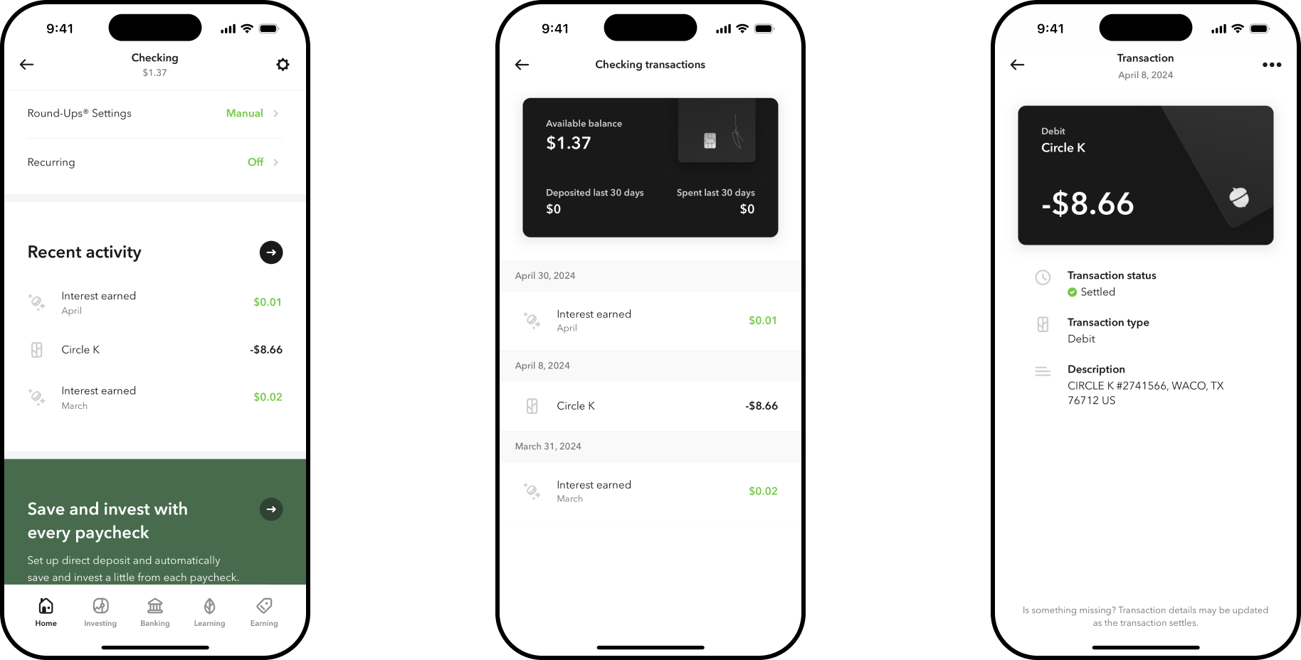
Three banking surfaces, three different looks.
Moments with no next step
Activation and transfers often just ended.
Strategic Focus
Rather than redesign each surface in isolation, I focused on the connective tissue between them — so every screen pointed customers toward a clear next step, in a shared visual language.
One Visual System
- Shared card, list, and button patterns
- A unified look for the Mighty Oak card
- Shared terminology across banking screens
Next Steps
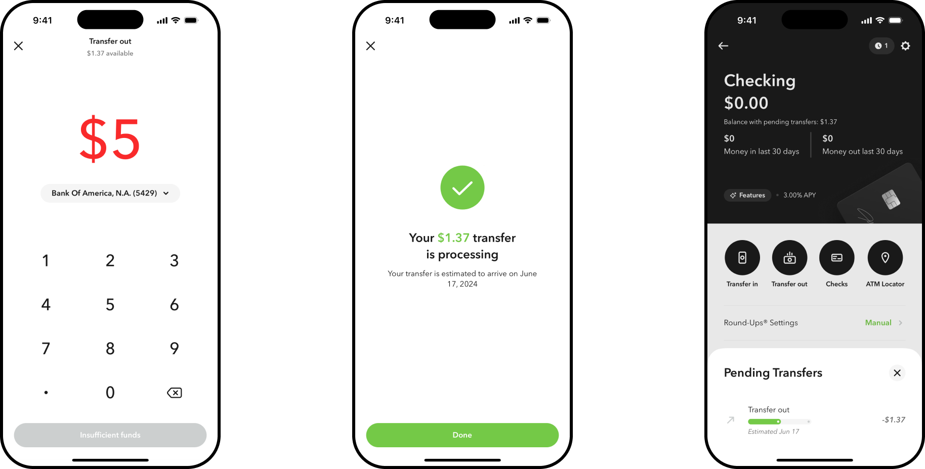
- Clear confirmation after every transfer
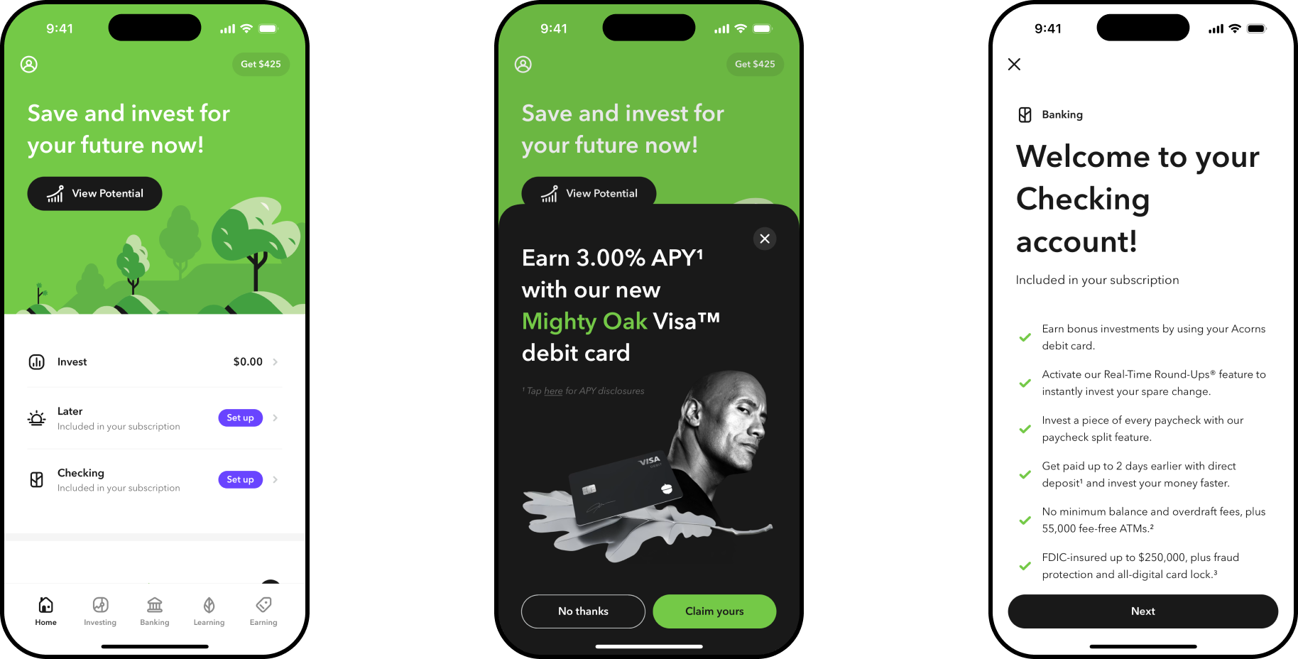
- A clear path from activation to first use
- Success states that point to what's next
In Context
- Lessons tied to the account they explain
- Organized around real decisions
- Short, task-based lessons over long reads
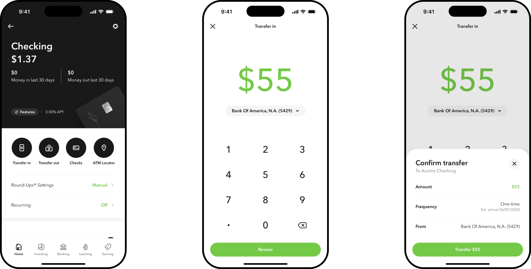
Money Movement
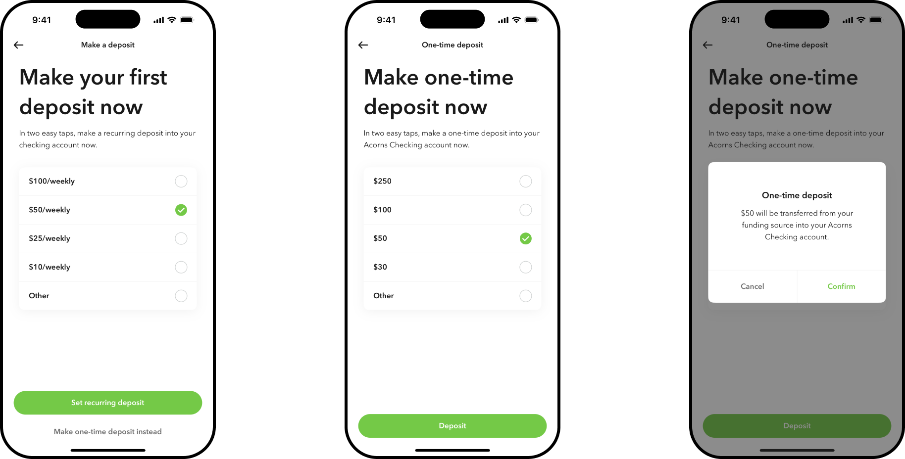
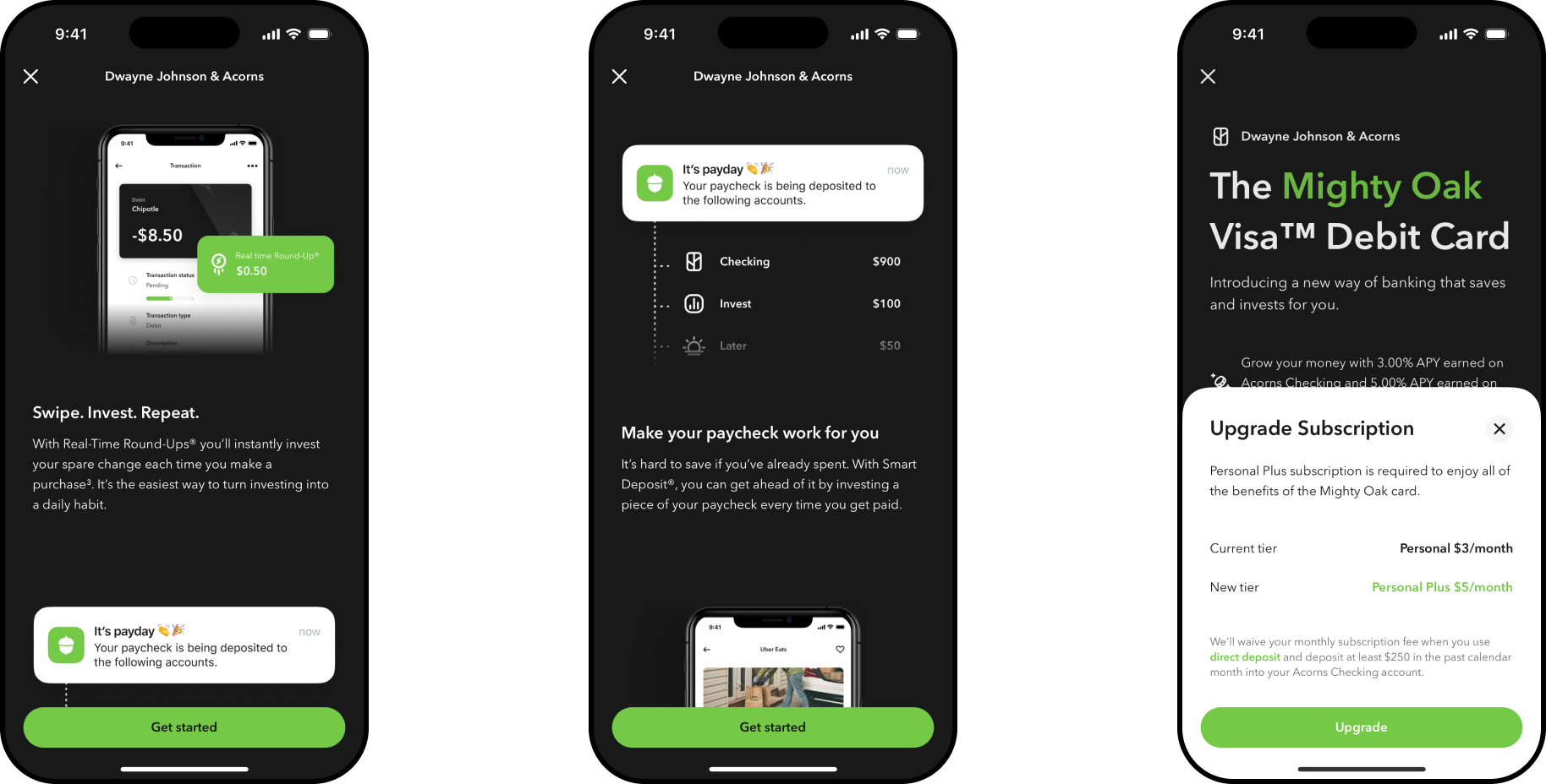
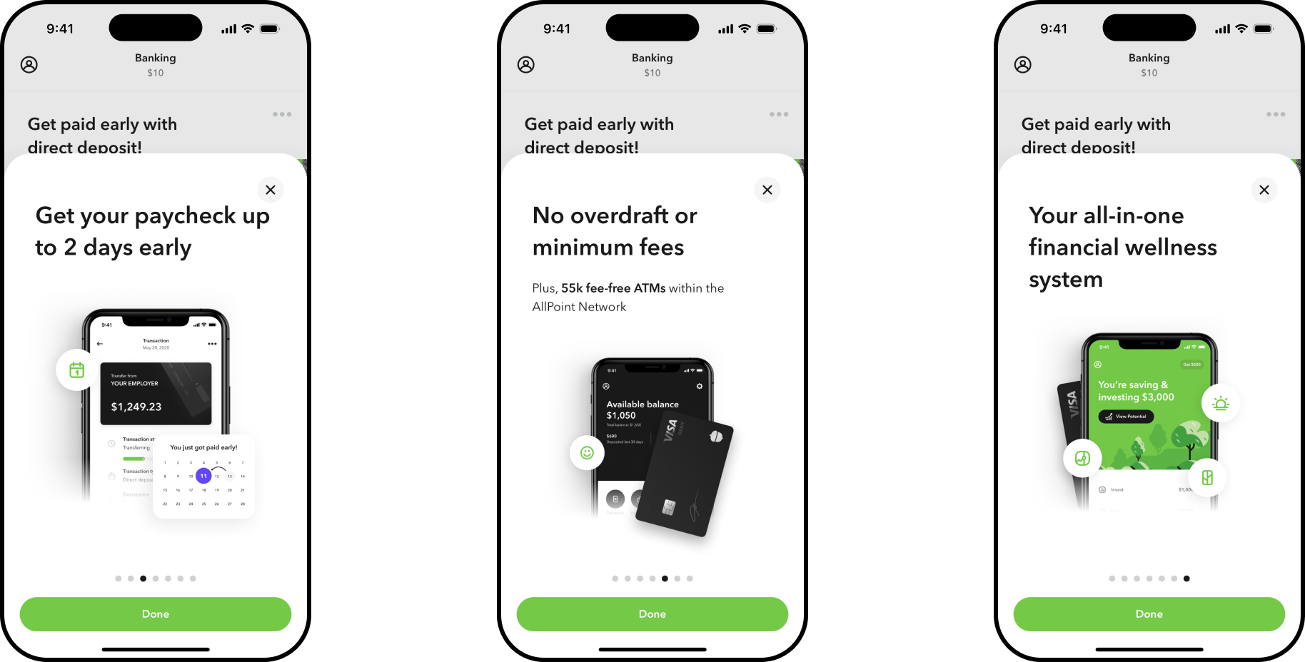
Key moments like this were often where customers lost the thread — a transfer with no confirmation, an investment with no explanation of what happens next. Smart Deposit automates investing a portion of every paycheck into a customer's Invest, Later, or Early account, with clear guidance on what's happening and why. Money Movement carries that same clarity into everyday transfers, giving customers a confident checkpoint — via a new confirmation step — before funds move.
Checking Setup
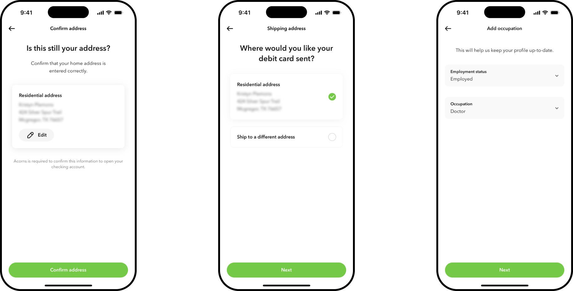
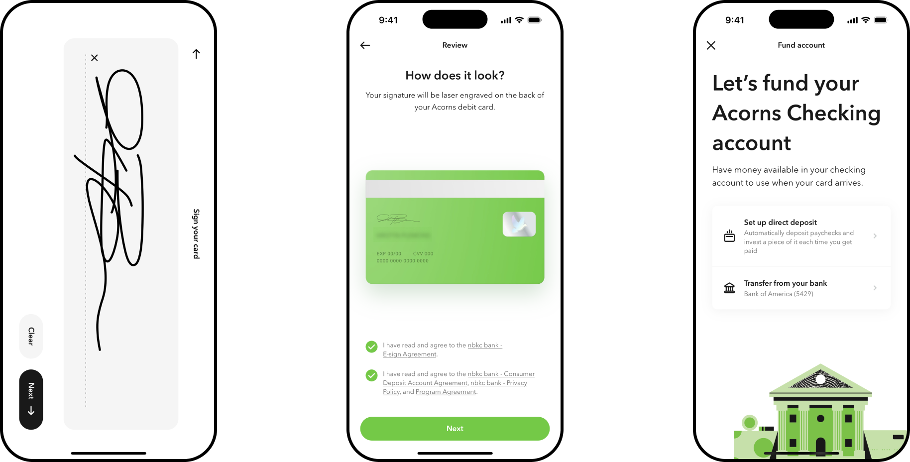
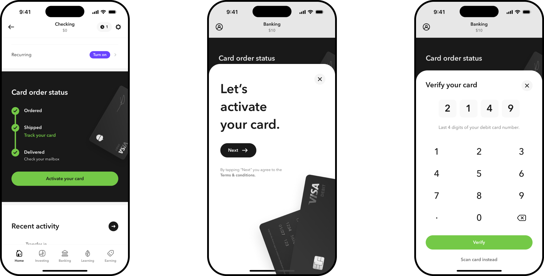
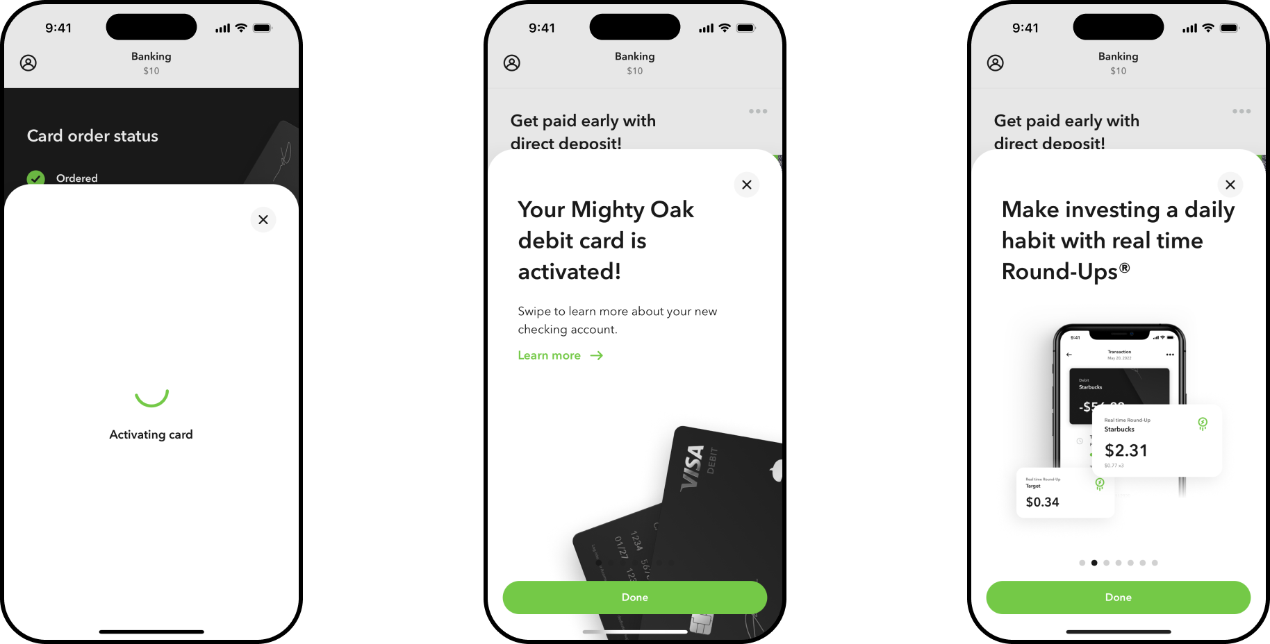
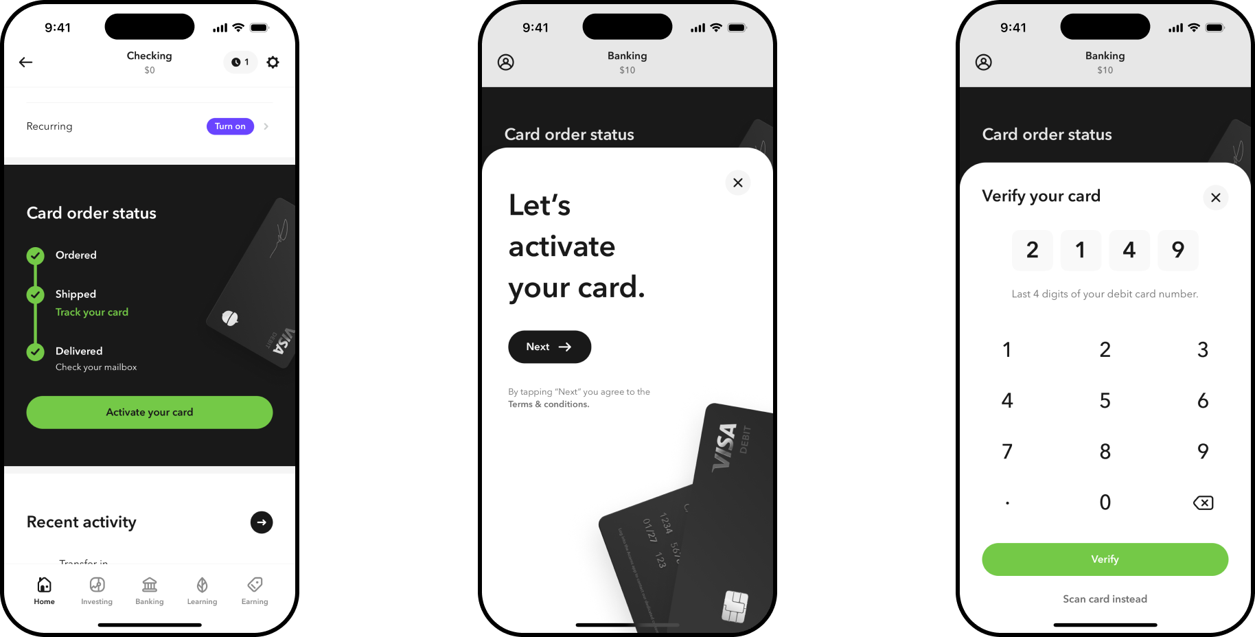
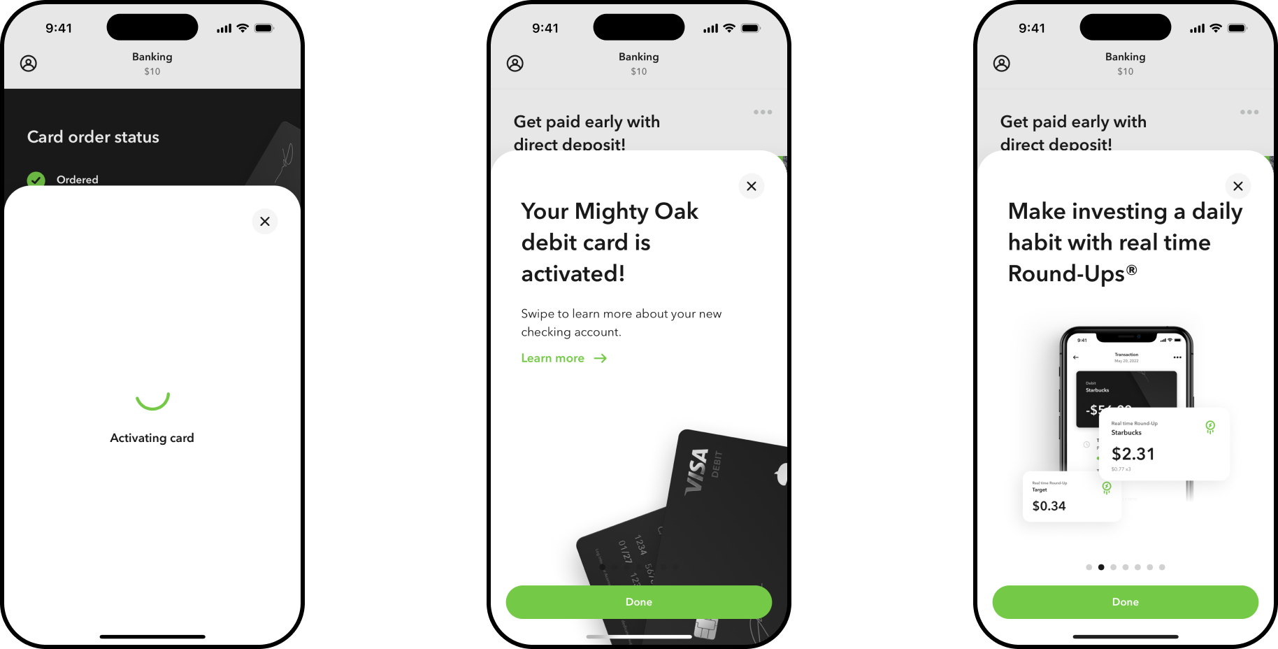
Opening a checking account meant collecting a lot of sensitive information up front — a common friction point in fintech onboarding, and exactly the kind of moment that used to end without a clear next step. I simplified the flow to stay approachable without losing what we needed to get customers set up, then carried that same care into the card itself: from the excitement of it arriving in the mail to activating it in-app, the goal was a moment that felt simple and delightful — activation in just a few intuitive screens.
Mighty Oak
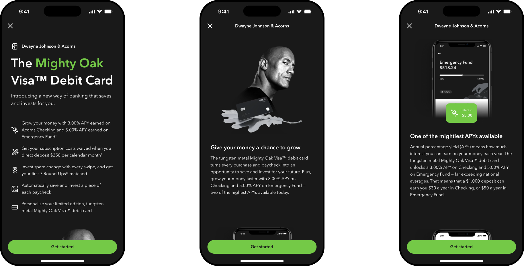
Mighty Oak is Acorns' flagship debit card — a matte black tungsten Visa card built around round-up investing, paycheck splitting, and a high-yield emergency fund, launched in partnership with Dwayne Johnson. It wasn't a typical celebrity endorsement: Johnson is an Acorns investor and a director of Acorns Labs, and co-created the card before fronting the national campaign that introduced it in November 2023.
Not just a face for the campaign — Dwayne Johnson helped build the card, then starred in the ads that launched it.
I designed the in-app product experience for Mighty Oak — bringing the card's visual identity in line with the rest of the app for the first time, the feature set that makes the case for it (round-ups, paycheck split, the emergency fund), and the moments where a customer's everyday banking meets a national ad campaign built around Dwayne Johnson.
The Learn Hub
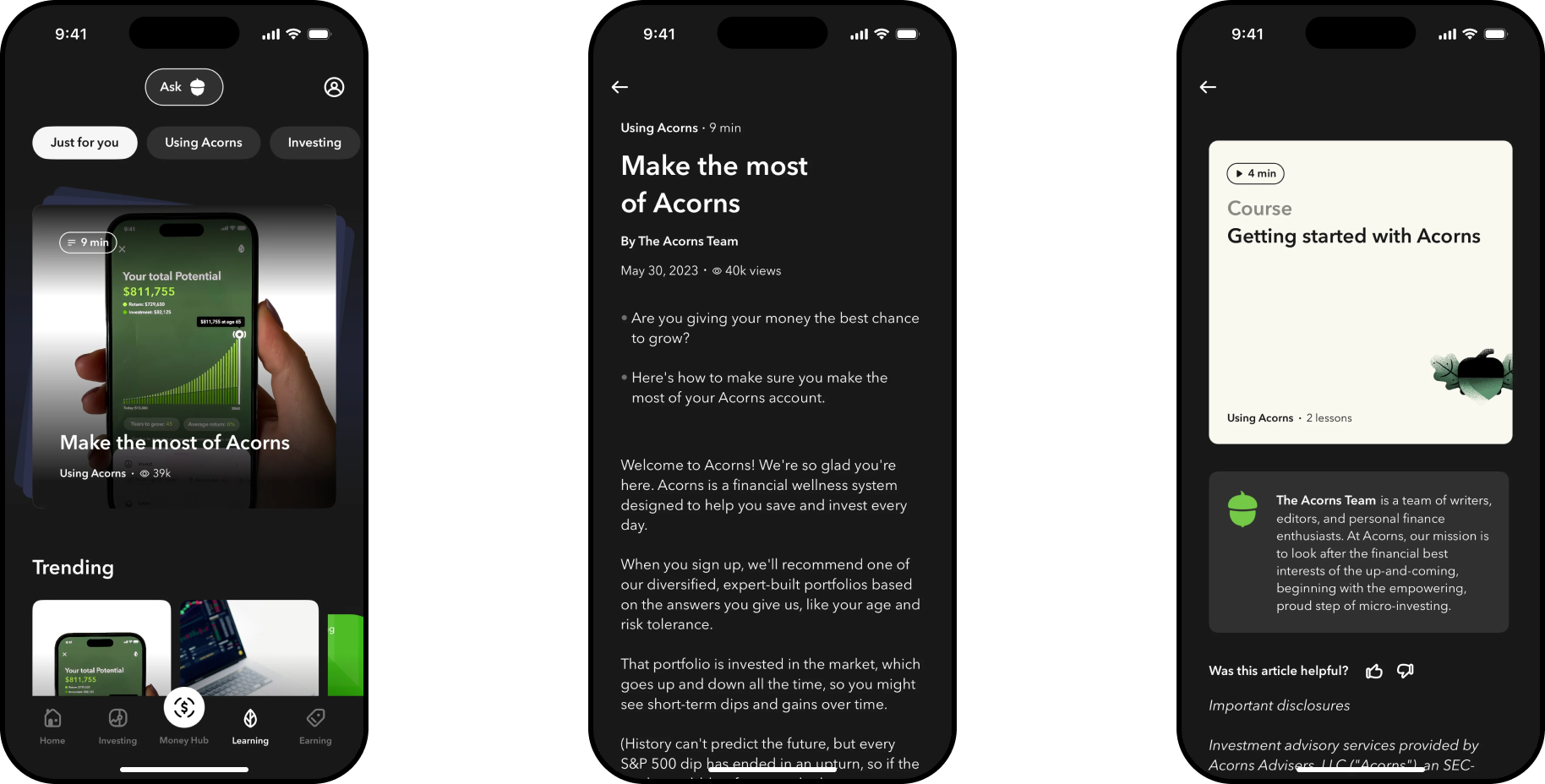
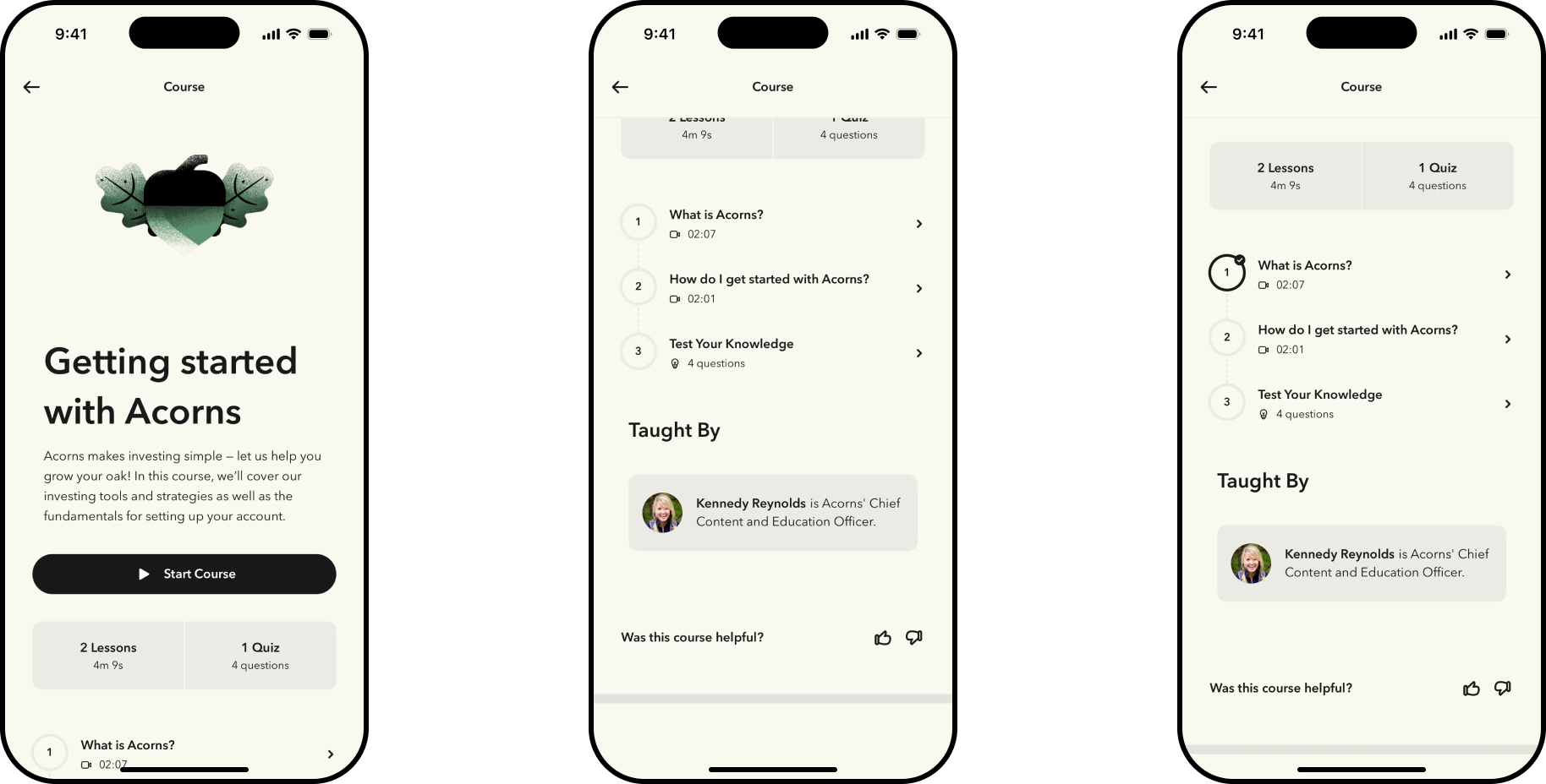
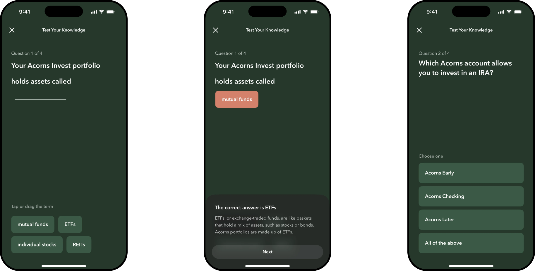
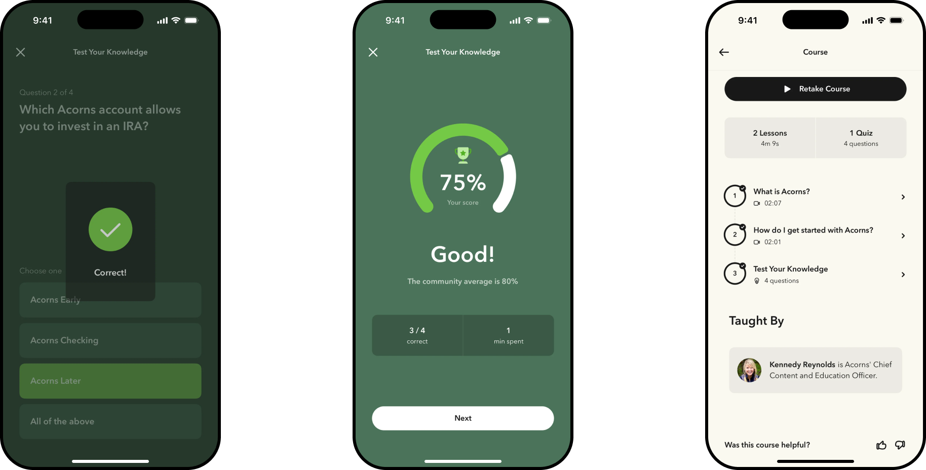
Learn used to sit apart from the actions it was meant to inform, so instead of treating financial literacy as a separate resource, I designed it as a full experience directly in the product — a content library of articles, short videos, interactive courses, and quizzes, one tap from the leaf icon on the home screen, with lessons organized around the same decisions customers were already making: investing, saving, borrowing, retirement, and taxes.
Content Library
- Expert-backed articles
- Short-form video lessons
- Interactive courses & quizzes
Core Topics
- Investing basics & ETFs
- Saving & risk tolerance
- Retirement, borrowing, taxes
For Everyone
- One tap from the home screen
- Standard on iOS & Android
- No separate sign-up required
Referral Program
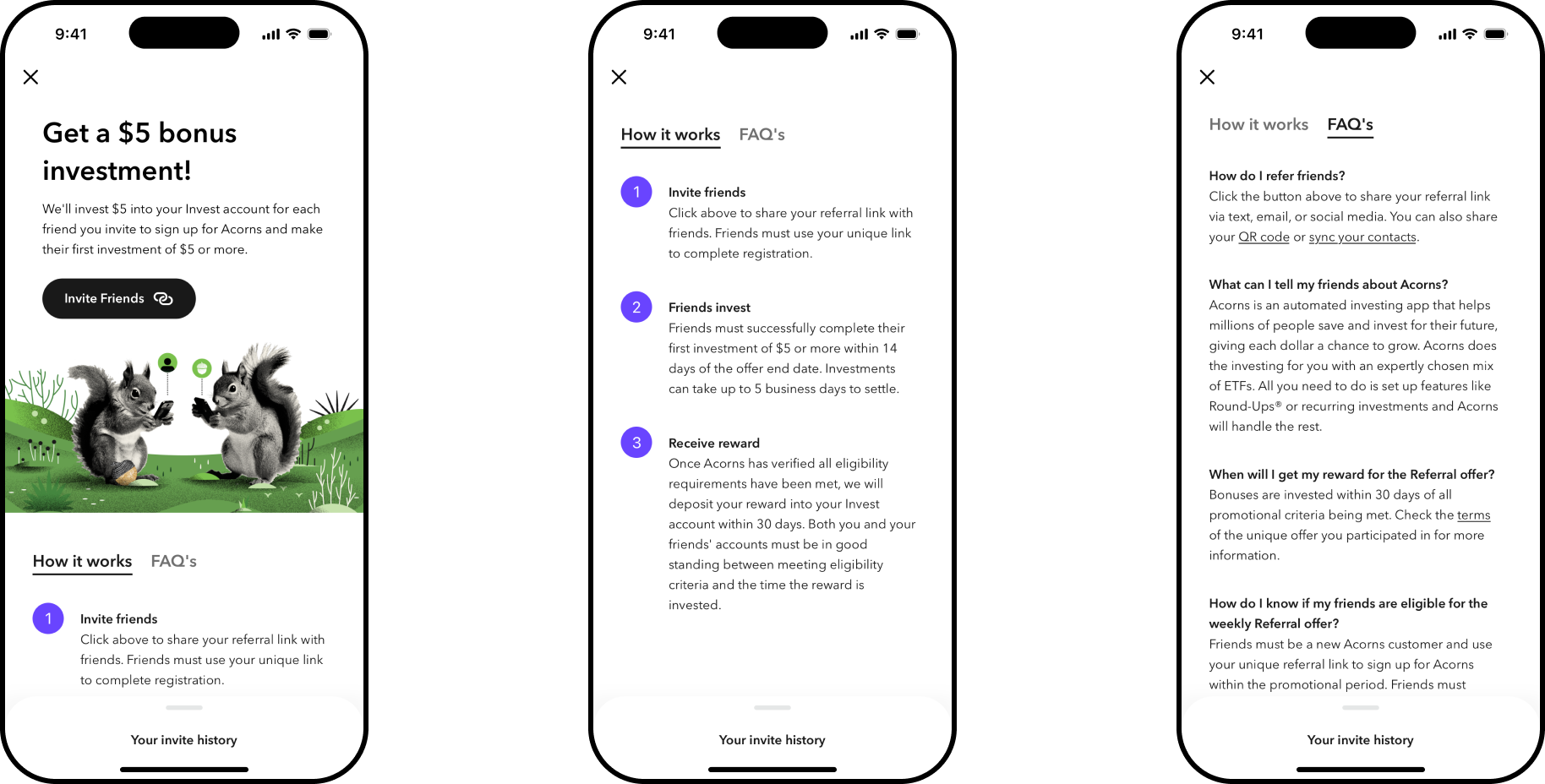
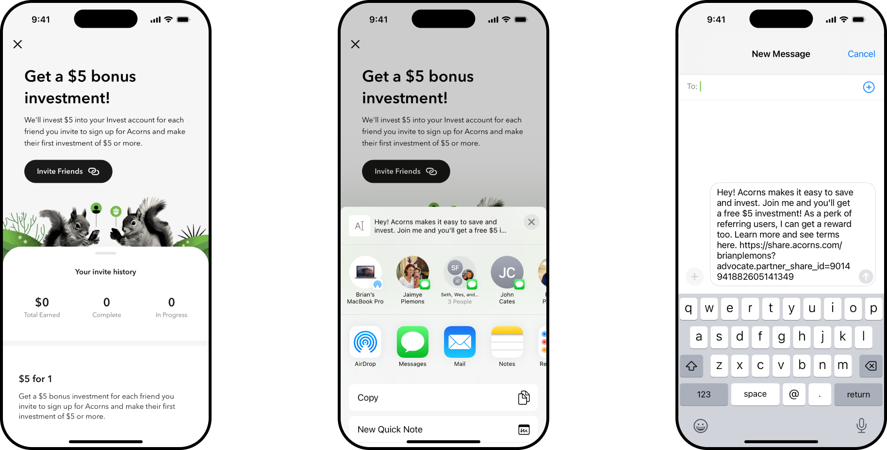
Referrals had become one of the top reasons customers contacted support — people couldn't tell what they'd earn or when, and kept asking. Interviews traced it back to one root cause: the answers already existed, they just weren't anywhere someone would think to look for them.
One clear action
Several competing prompts became a single button, so there's never a question of what to do next.
Answers where people looked
How It Works and the FAQ moved to the main page, where customers see them first.