Designing America's first fully digital mortgage experience.
Overview
Rocket is the largest mortgage lender in the country, and I led product design on what became the first fully digital mortgage experience in America — the entire path from application to close, without ever needing to pick up the phone and talk to a banker.
I designed the experience twice: first on web, then again — deeper and more ambitious — as a fully native iOS app. Both shipped as end-to-end journeys built around the same core idea: one guided path from a client's first goal to a closed loan, with a live expert always in reach and never a required phone call.
The strategic case traces straight back to Rocket's mission — help everyone home — through growing market share profitably. That's the throughline for everything that follows.
The Problem
Clients wanted control and flexibility in how they got a mortgage — digital convenience, human support when they needed it, and the ability to complete an application at their own pace. Our pilot data made the case impossible to ignore: 71% of clients told us they wanted online application options, and conversion improved dramatically wherever a digital option existed.
We'd proven it — now it was time to scale it. Not toward full automation, but full client choice, with human support always available.
The Opportunity
The strategic case was simple: grow the top of the funnel, convert more clients, and lower the cost to produce. In 2025, three initiatives proved the digital funnel could work — in 2026, the focus shifted to making it navigable, guided by self-service, trust, and customer-centric design.
Structuring the Journey
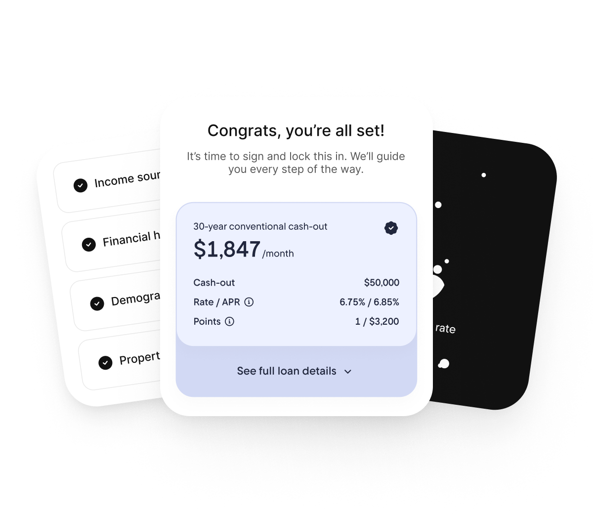
Before any screen got designed, I mapped the navigation itself — working closely with engineering and research to figure out how a client moves from an anonymous visitor to a closed loan, and where the structure needs to change along the way. Pre-auth, the whole flow is built to guide: a few goal-setting questions lead into the application, and the application leads into choosing a loan. Once a client authenticates, the job of the navigation flips — from guiding them forward to helping them finalize the loan they've already chosen. The four cards below are that structure at a glance; each one gets its own deeper walkthrough further down.
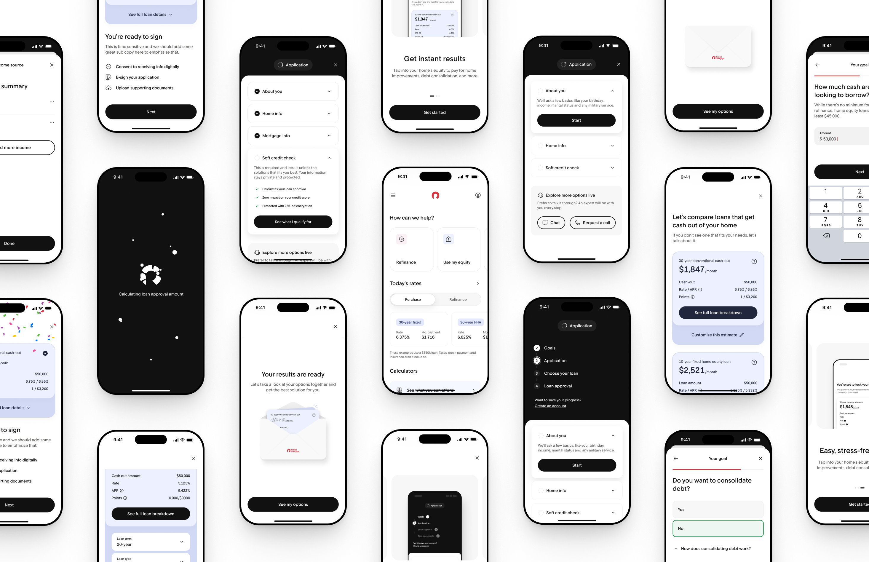
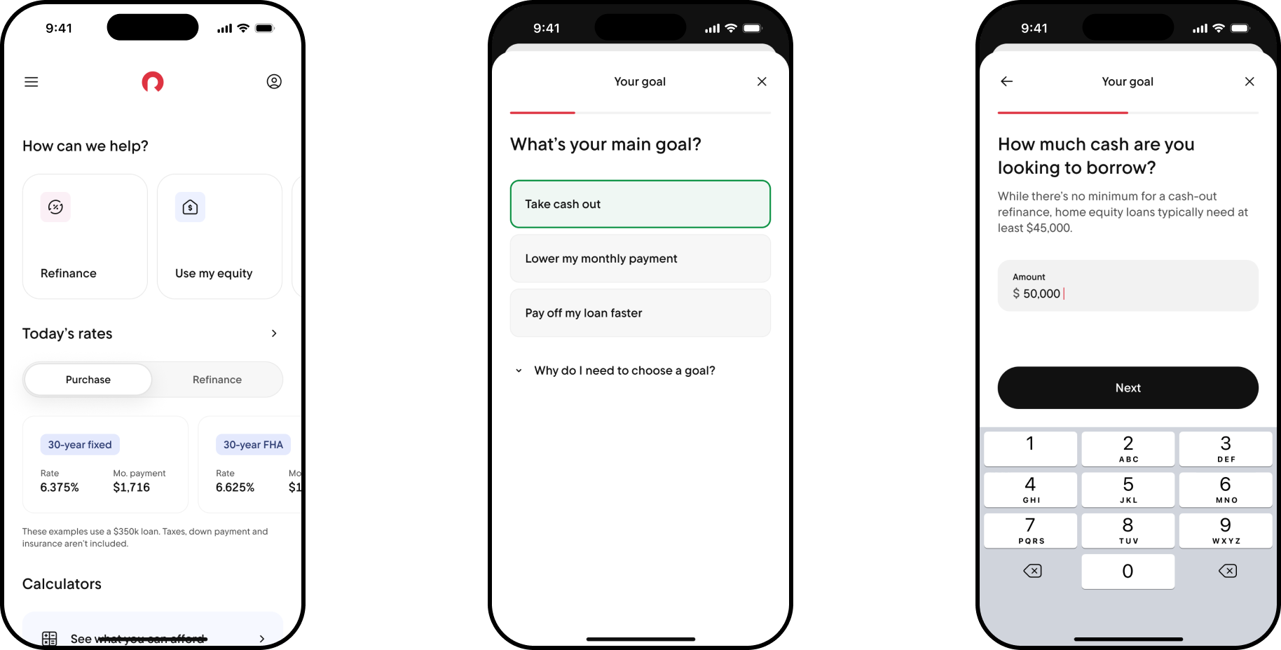
The entry point to the whole funnel — and the one place a client hasn't earned any trust yet. Every question here has to justify itself.
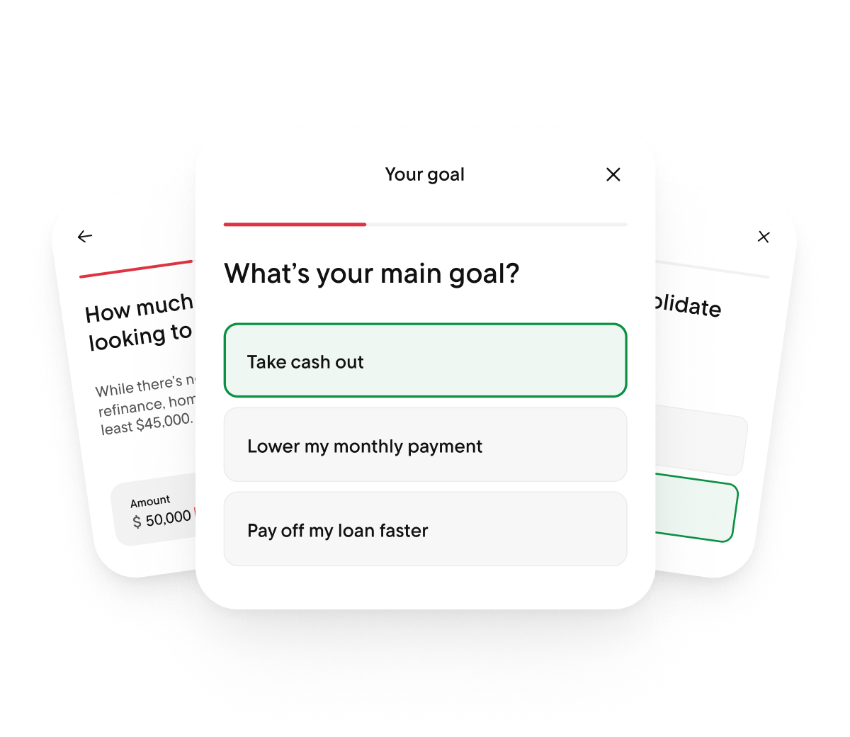
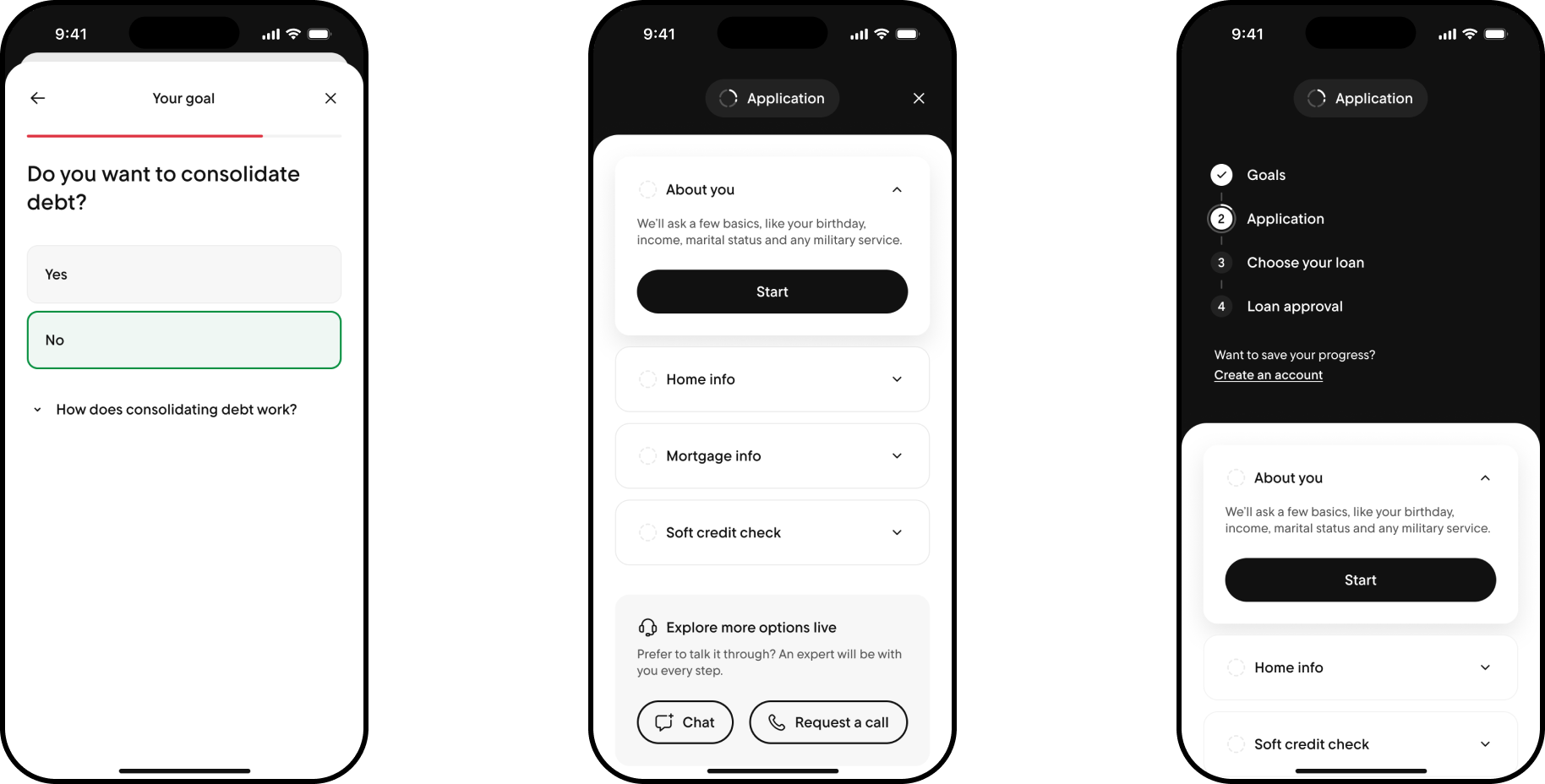
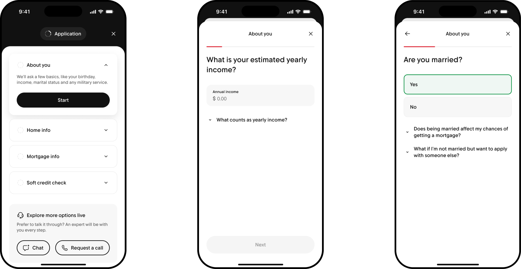
The workhorse of the pre-auth flow — everything about the client, their home, and their mortgage, one guided step at a time.
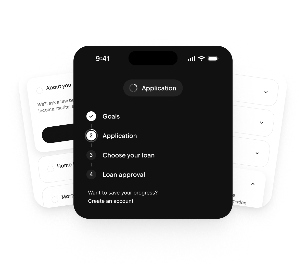
The moment intent turns into a real decision — this is where a client picks a direction instead of just exploring one.
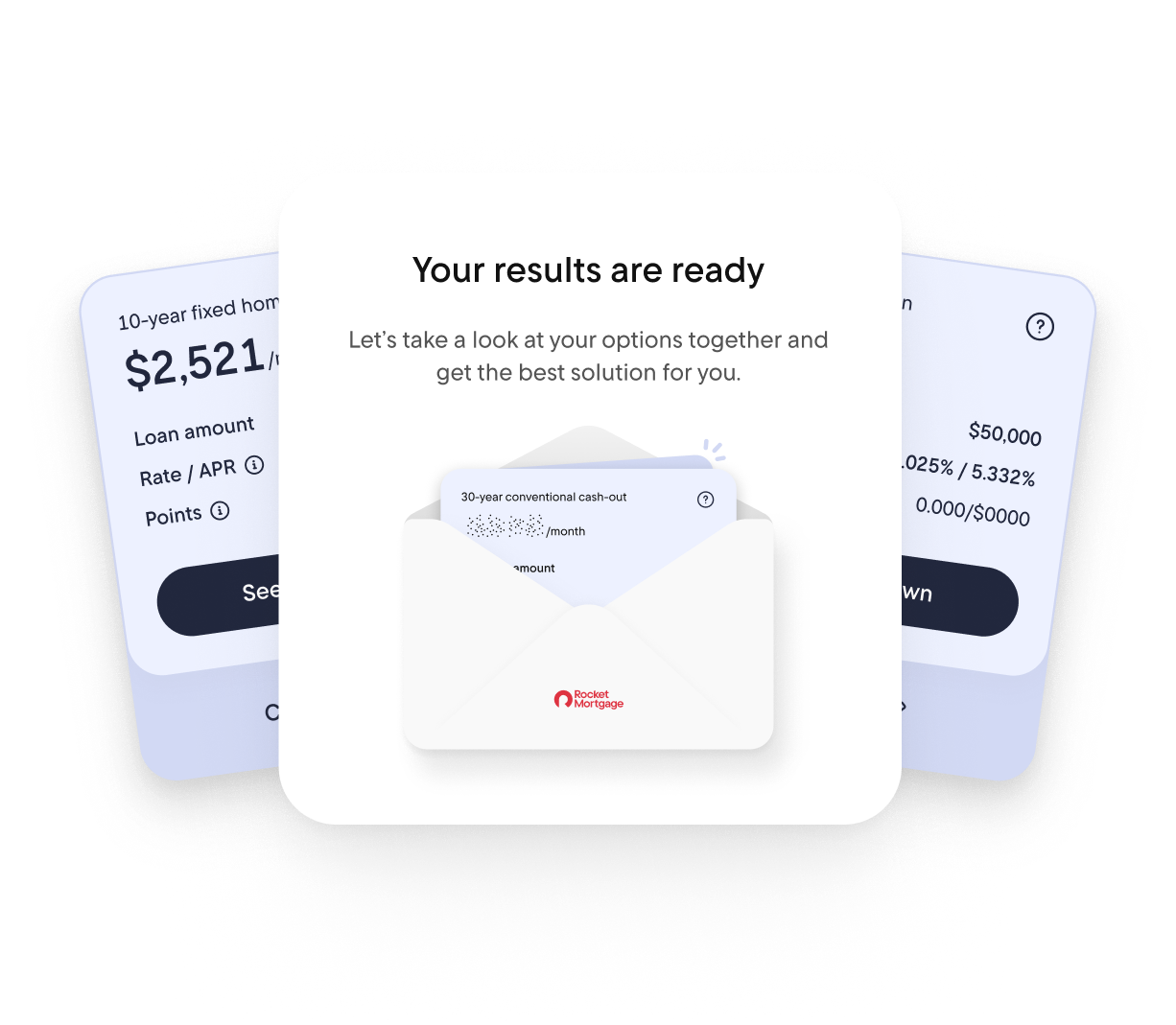
Post-auth, it's less about choice and more about momentum — carrying a client to close without ever losing them.
Setting Goals
The hard part here wasn't the questions — it was deciding how many to ask before a client had given us anything in return.
Curiosity is fragile
Every extra step ahead of the application is a chance to lose someone who was only ever curious.
Everything after adapts
A refinance question never shows up for someone who's buying, and vice versa.
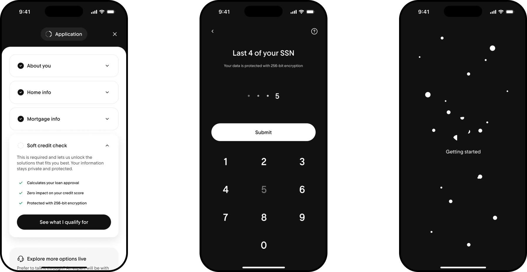
Application
A mortgage application is inherently long — the risk is making it feel that way.
An accordion, not a long form
Four short sections instead of one long, continuous form to scroll through.
An expert on every step
Trust drops the moment a form gets hard, so live help is one tap away throughout, not just at the end.
Choosing Your Loan
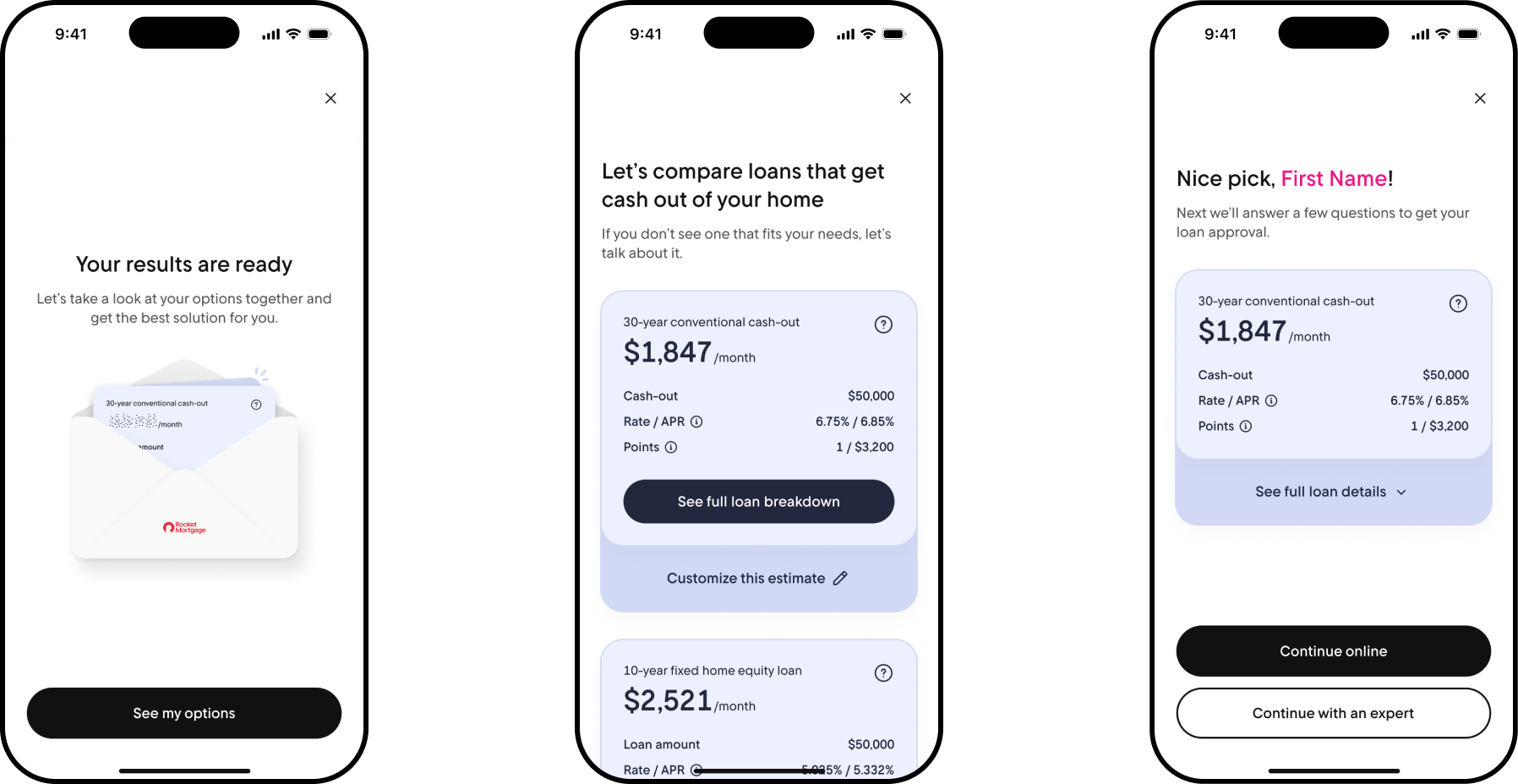
Most loan comparisons show you a set of options and stop there.
Every number editable
Term, type, and rate change in place, so a client isn't comparing static offers — they're shaping their own.
Their choice to the end
Once a loan is picked, they decide how to move forward: continue online or with an expert.
Getting Loan Approval
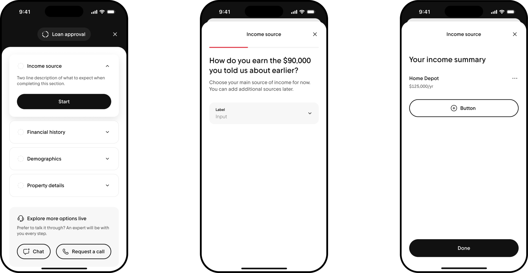
By the time a client reaches approval, they've already learned the accordion pattern from the application.
Reused on purpose
Rather than introducing something new, the same accordion carries into approval.
Just different questions
Income source, financial history, demographics, and property details.
The Outcome
The pattern held. In production from 7/10/25 to 10/20/25, clients who chose to continue online closed at 25.38% — more than double the rate of clients who saw a solution and passed on it entirely (10.2%), and meaningfully ahead of those who chose not to continue online (20.63%). At the scale Rocket operates, that difference compounds fast: instant product presentation alone is projected to add $184.6M in closed loan volume per 100,000 app starts.
Rocket 4
The culmination of thousands of hours of design work from over 100 product designers, researchers, conversational AI designers, and content designers, spanning eight months.
With 10,000+ components, 500+ unique screens, and an entirely new color, font, and element system — built with accessibility as a first-class priority — it's our most expansive and inclusive design system to date, built to help tens of millions of everyday Americans find and buy their dream home.